









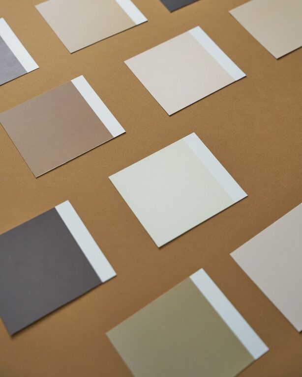
Choosing calm colors for your home can make each room feel more comfortable, balanced, and welcoming. Soft colors are often associated with rest and relaxation, but a peaceful home does not have to be plain or boring. With the right combination of shades, textures, and natural light, you can create spaces that feel soothing while still showing your personal style.
Start With the Feeling You Want
Before choosing paint or furniture colors, think about how you want the room to feel. A bedroom may benefit from quiet, restful shades, while a living room might need a little more warmth and energy.
Consider words that describe your ideal space, such as:
– Relaxed
– Bright
– Cozy
– Airy
– Warm
– Natural
– Simple
– Comfortable
These words can guide your choices. For example, pale blue may suit a room that should feel fresh and restful, while warm beige can create a cozy and welcoming atmosphere. Starting with the desired mood helps narrow down the many color options available.
Understand the Difference Between Warm and Cool Colors
Colors are often described as warm or cool. Warm colors include soft yellows, creamy whites, gentle terracotta, and warm beige. Cool colors include pale blues, soft greens, lavender, and blue-gray.
Both groups can create a calm environment, but they produce different effects.
Warm Calm Colors
Warm shades can make a room feel comfortable and inviting. They work especially well in spaces that receive limited natural light or face north. Soft sand, ivory, oatmeal, and muted peach are examples of warm colors that add comfort without feeling intense.
Cool Calm Colors
Cool shades often make a room feel fresh, open, and peaceful. They can be a good choice for sunny rooms or spaces where you want an airy feeling. Soft sage, misty blue, pale gray, and muted aqua can add color while maintaining a relaxed look.
When selecting a color, think about the room’s existing features. Wood floors, natural stone, metal finishes, and furniture upholstery may already lean warm or cool.
Choose Muted Shades Instead of Bright Versions
A color can feel calm when it has been softened with gray, white, or earthy undertones. Instead of choosing a bright blue, consider a dusty blue. Rather than a strong green, try sage or eucalyptus.
Muted colors are easier to live with because they tend to blend naturally with other shades. They also provide a gentle backdrop for artwork, plants, textiles, and decorative objects.
Some calming alternatives include:
– Dusty blue instead of bright blue
– Sage green instead of vivid green
– Warm white instead of stark white
– Clay beige instead of orange
– Soft lavender instead of intense purple
– Mushroom gray instead of dark charcoal
This does not mean bold colors should never be used. A muted main color can be paired with a deeper or brighter accent for added personality.
Pay Attention to Natural and Artificial Light
Lighting can change the appearance of a color throughout the day. A shade that looks soft and warm in the morning may appear cooler in the evening. Before making a final decision, test paint samples on more than one wall.
Observe the color during:
– Morning daylight
– Afternoon sunlight
– Evening lamp light
– Cloudy weather, if possible
The direction of the windows also matters. Rooms with strong southern or western light may make colors appear warmer and brighter. Rooms with northern or eastern light may make them look cooler or more subdued.
Light bulbs also influence color. Warm bulbs can bring out beige, cream, and yellow undertones, while cooler bulbs may emphasize blue and gray. Testing samples under the room’s usual lighting can help prevent surprises.
Use a Simple Color Palette
A calm home usually benefits from a limited color palette. Too many unrelated colors can make a space feel busy, even when each color is attractive on its own.
A simple palette can include:
– One main wall color
– One or two supporting colors
– A darker accent shade
– Neutral tones for balance
For example, a living room might use warm white walls, soft sage textiles, natural wood furniture, and charcoal accents. A bedroom could combine pale blue walls, cream bedding, light wood, and muted gray accessories.
Repeating colors throughout the home can also create a smooth visual connection between rooms. The colors do not need to match exactly. Similar undertones and related shades are usually enough.
Consider the Whole Room
Paint is only one part of a room’s color story. Look at the floors, furniture, curtains, rugs, lighting, and decorative items before deciding on a wall color.
If a room already contains patterned furniture or a colorful rug, a quiet wall color may help the space feel balanced. If the furniture is mostly neutral, you may have more freedom to add a soft accent color.
Create a small collection of samples before making a decision. Include:
– Paint swatches
– Fabric samples
– Flooring materials
– Curtain or rug colors
– Metal and wood finishes
Place the samples together and view them in the actual room. This makes it easier to see whether the colors support one another.
Use Nature as Inspiration
Natural colors are a reliable starting point for a calm home. Shades inspired by sand, stone, leaves, clouds, water, and wood tend to work well together because they are familiar and easy on the eyes.
A nature-inspired palette might include:
– Warm ivory
– Soft taupe
– Pale olive
– Misty blue
– Light brown
– Muted clay
Plants, woven baskets, linen fabrics, and wood finishes can reinforce this look. Natural materials also add texture, which keeps a neutral color scheme from feeling flat.
Add Contrast Carefully
A completely light room can sometimes feel washed out. Adding contrast helps define the space while preserving a peaceful atmosphere.
Try introducing contrast through:
– A medium-tone rug
– Dark wood furniture
– Soft black hardware
– Deep green cushions
– A muted blue chair
– Framed artwork with darker details
The goal is not to make every element the same brightness. A few deeper shades can give the eye places to rest and make lighter colors feel more intentional.
Choose Colors Room by Room
Different rooms may call for different versions of calm.
Bedroom
Bedrooms often work well with soft blue, muted green, warm white, or gentle gray. Keep strong contrasts to a minimum and use comfortable fabrics to support the restful mood.
Living Room
A living room can handle slightly warmer or richer shades, such as sand, mushroom, olive, or dusty blue. Combine these with natural textures and flexible accent colors.
Kitchen
Warm white, pale gray, soft green, and light beige can make a kitchen feel clean without appearing cold. Consider the color of cabinets and countertops when selecting the walls.
Bathroom
Soft aqua, pale blue-gray, warm white, and light stone shades can create a fresh atmosphere. Keep the palette simple if the room is small.
Test Before You Commit
Color swatches on a small card may not show how a shade will look across an entire wall. If possible, paint a large sample area or use removable sample sheets. Leave the sample in place for several days and view it at different times.
Do not rush the decision. A color that looks attractive in a store or online may appear different in your home. Testing allows you to consider the lighting, furnishings, and surrounding rooms together.
Create a Calm Home With Confidence
Choosing calm colors is less about following strict rules and more about creating balance. Start with the mood you want, study the lighting, and select shades that work with the materials already in your home. Muted colors, natural inspiration, and a limited palette can provide a peaceful foundation.
Most importantly, choose colors that make you feel comfortable. A calm home should reflect the way you want to live, whether that means soft neutrals, gentle greens, pale blues, or warm earthy tones.